Adam Etherington, BSC on A Discovery of Witches Season 2

Season 2 of A Discovery of Witches found cinematographer Adam Etherington, BSC partnering with director Farren Blackburn to continue the adventures of historian and witch Diana Bishop (Teresa Palmer) and her unlikely ally, the vampire Matthew Clairmont (Matthew Goode). Both Etherington and Blackburn were new additions to the series, and together they set out to build upon the visual language that had been established in Season 1 while embracing the opportunities afforded by a new twist in the narrative, which sends Diana and Matthew back in time to the Elizabethan era.
Etherington turned to Panavision for his camera and lens package, and gaffer Andrew "Tala" Taylor sourced lighting equipment through Panalux. "Tala handled the interaction with Panalux, as is generally the way with this scale of production," Etherington shares. "Both he and I have great relationships with Panalux, and they were very supportive of what we were trying to achieve with the show. It was fantastic to have them in our corner."
Panavision recently connected with Etherington for a firsthand account of the cinematographer’s creative approach to balancing the show’s period and contemporary settings, and of the process that led him to frame the story with Panavision’s PVintage optics.
Panavision: How did you come to be involved in Season 2?
Adam Etherington, BSC: The meeting came about through a competitive interview process, as is so often the way. I’m a huge believer in the value of preparation, and I dedicate a large amount of time to understanding a project and developing ideas before I enter a pitch. I studied the first season of A Discovery of Witches as well as other relevant material that might be useful in light of the move to an Elizabethan setting. I then did quite an in-depth breakdown of the script, looking into characters, potential arcs in relation to the first season, motivations, key themes and motifs, and of course possibilities for the visual realization of those ideas. The script is the foundation of the choices we make, and understanding the philosophies of the storytelling is such a crucial element in creating a world for the audience.
I also studied Farren's most recent work and read interviews where he'd talked about other projects, and I looked at interviews with other key creatives from the series and wider material about the show itself. Then it was a case of developing a base of visual ideas and a tranche of reference material that I could offer up, if appropriate, during the meeting.

From left: 1st AD Seth Adams, director Farren Blackburn, and cinematographer Adam Etherington, BSC.
Had you known Farren previously?
Etherington: This was a new opportunity for me to meet and work with Farren. His usual collaborators were unavailable, which opened the opportunity for others to pitch on the show. I’d been aware of his work for a very long time and knew his reputation for delivering some of the most exciting shows out there in innovative and progressive ways — he was already directing massive shows when I was still a camera assistant. This was a great opportunity for me to get the chance to collaborate with him.
Coming into Season 2, where did you and your collaborators see opportunities to evolve or expand upon the series’ visual language?
Etherington: From the very start, Farren had a wonderful clarity of vision for the ethos and ideology of the series’ visual language, including an assured perspective that the camera’s movement should be wholly motivated by the narrative. He wanted a precision-based approach with a refined set of rules as to when and why the camera should move. This was something that he and I discussed at length. Rather than simply falling into coverage, we knew we wanted elegant shots that developed and evolved to tell the story. We wanted the photography to emphasise and enhance the power play within the narrative arc, with lensing that was appropriate to each character’s emotional positioning within the narrative.
We also wanted to build a strategy of graphic compositions to convey the grandeur and beauty of the incredible locations and sets. The world deserved big, bold, beautiful wides that could combine with close, intimate frames that would draw the audience close-in to a character's experience for moments of confidence, suspicion or tenderness, enabling the audience to experience those beats with the characters.
There were things to avoid, too. We actively made a call to avoid using handheld or any superfluous, unmotivated camera movement, as both of these things felt as though they might take away from the precision-based ideology of the visual language as a whole.
Beyond the first season, did you and Farren share any specific visual references?
Etherington: The first season was obviously something that we studied and considered carefully in order to ensure that the choices we were making were respectful to the origins of the show as well as its audience and fan-base. That said, the Elizabethan landscape was a new world to explore, and Farren had a clear strategy as to the way he wanted to invite the audience into that world.
Although I had brought a base of references and visual ideas to the initial meeting, I quickly learned that Farren's preference is to avoid homing in on any one defined cinematic reference. This meant that although I did use a number of other films in my lighting reference and mood boards, these were individual images that carried an overarching representation of tone and mood.
Farren prefers the use of stills photography rather than cinema when it comes to reference work, so our lighting mood boards consisted more so of artists' renderings as well as beauty, still life and landscape photography. It gave us a wonderful freedom from any sense that we were at risk of attempting to recreate or directly reference any one film or show too closely. I can see now how it has enabled him to keep his work so consistently innovative and unique, as it relinquishes the creative attachment to anything that has come before.
What brought you to Panavision for your camera and lens package?
Etherington: I’d worked recently with Panavision on a series called Temple, which we shot using Panavision spherical Primos and Cooke Xtal Xpres anamorphics. It was my first time working with Panavision optics, and I was completely blown away by the caliber of their look and feel. The commitment to optical development that is synonymous with Panavision has always fascinated me, and it really showed in the qualities of the images that those lenses created. When it came to selecting the right lenses for A Discovery of Witches, I knew the high caliber look and feel of Panavision optics would be perfect for the series’ visual landscape.

How did you decide which lenses in particular you would use for A Discovery of Witches?
Etherington: I am a big believer in testing. It is an opportunity to be playful and experiment in order to push boundaries and find something with a unique character that can enhance the visual storytelling. We were also very conscious that, as the show already had an established and astute audience, it would be important to be respectful of that in our choices for the world. Testing was an opportunity to make those choices as informed as possible.
I have always had an enormous affection for vintage lenses, and given Farren's brief to me for the show's aesthetic, I knew that an older lens series would suit the intended approach. We wanted a lens series that would elevate the beauty and scale of the Elizabethan landscape but would also have the contrast rendition, beautiful roll-off and wonderful clarity to capture and convey both the power and the intimacy of the characters' journeys.
This was the first time I've really had the opportunity to properly explore Panavision's spherical range of optics in a controlled scenario. We needed a series that would provide us with a great range of focal lengths, that would be technically sound for our assistants to work with, and that above all would render beautiful and striking images with a world-class aesthetic. I had a few ideas as to what might be right for us, but the only way to really find out was through testing.

What did you actually shoot for this lens test? What were you looking at and testing for?
Etherington: There are so many things you’re looking at and for in a lens test. Many of them are technical representations of a lens’ performance against other optics, but largely, for me at least, you’re looking for an instinctive feeling. It is as much about the way that a lens conveys the connection between viewer and subject as it is about how many lines of projection it offers.
We set up our test with three different subjects and three different lighting conditions: exterior daylight, candlelit and lit. We wanted to see the way that the lenses handled contrast, roll-off, color rendition, flare, veiling, consistency within the range, any imperfections and aberrations, the shape and texture of the bokeh, extreme contrast, highlights and shadows, skin tones, image sharpness and projection, as well as the falloff of projection across the sensor. We created an environment wherein we could keep a consistent T-stop across the test range, with a person as a subject, various light sources in deep background for bokeh, a Macbeth chart and gray card, as well as a direct source we could pass over the lens to see the way the lens flared. We shot a couple of focal lengths from each lens series, and a couple of T-stops to see how the lenses performed at different stops.

What ultimately led you to choose PVintage lenses for this story?
Etherington: The first series of A Discovery of Witches had originated on Canon K35 lenses, but Farren was very keen to work with a lens series that would offer a greater range of focal lengths, particularly a series that included a 40mm, which is a favorite of his. So I set about trying to find an option that would give us a beautiful aesthetic but that would also offer the range of focal lengths desired.
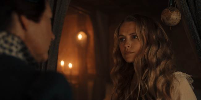
I knew the qualities of the PVintage lenses from discussions with other cinematographers and with the brilliant Kirstie Wilkinson, who was our tech contact at Panavision, but I hadn’t yet tested them myself, so we wanted to see them alongside some more familiar options in order to understand them better. In testing, we noticed the lenses had the unique qualities and beautiful nuances of vintage optics, but they rendered an image that carried a fantastic weight and clarity without being too razor-sharp. They handled extreme contrast beautifully, combining with the format for a sophisticated, considered roll-off from the highlights. The projection across the sensor was such that it carried the eye to the subject, with a gentle falloff in exposure and roll-off in focus, and they created a bokeh that was beautiful without being distracting. They also didn’t seem to fall apart in the same way that some other older lens series do. They delivered an image that felt like it was from the highest caliber of optics, with a contrast rendition that we knew would support us in creating mood and atmosphere when required within the storytelling. They also flared beautifully and offered an internal refraction of light that split colors across the spectrum in a way we felt would work well as a narrative device for certain moments within the storytelling. There was a beautiful softness to the image, too, which was exactly what we were looking for in some of the more intimate moments within the storytelling.
Did you seek to visually differentiate the period and contemporary portions of the story?
Etherington: We didn’t actively look to push the worlds apart. We were mindful that we would be catapulting the audience back and forth between two time periods, so we actually looked to develop a base of constants between the worlds that would help the universe coalesce whilst allowing the nuances of each world to provide it with its own visual beauty and identity.
The distinguishing factors between the worlds primarily manifested themselves in the way interactive and practical light was motivated due to the inherent differences of the respective eras. In the Elizabethan era, we had this wonderful combination of soft, warm, incandescent candlelight, and directional, motivated, atmospheric daylight or moonlight to play with. We wanted to build color separation into the images, so we exploited the differences in tone and color temperature between the two sources to help build and maintain depth and texture in the images. With the fantastical ideologies and beautification of the world in mind, we decided to make use of the incandescent sources - be it fire, candles or both - as a constant both for day and night work. This meant that we were able to exploit the benefits of having mixed color temperatures for color separation as well as motivated sources in order to beautify the visual landscape and highlight the opulence of production designer James North's sets.
Something that came up repeatedly in prep from the lead creatives was that they wanted the show to be photographically rendered in a way that would allow the audience to enjoy the beauty and opulence of the costume and set design that had been developed for the Elizabethan world. We took this into direct consideration in our strategy, ensuring that we elevated the exposure of interior scenes by around 1/3 to 1/2 of a stop above where we intended to finish. This was in order to protect the integrity of the 'digital neg' and leave us a clean starting point free of video noise, but with the aesthetic ready for the grade. We also elected against shooting with a lower ISO in-camera as we didn't want to compromise the upper end of the highlights depending on the use of incandescent sources in the scene.
With our fantastic DIT Jo Barker, we then refined the look in our dailies, where she and I collaborated to bring the exposure to where we felt was appropriate to the scene. The strategy worked well and was appreciated by our lead creatives, as it gave us room to maneuver in the grade and a strong 'digital neg' with a clean base and plenty of dynamic range.
Can you elaborate on the idea of having a 'base of constants' in your lighting while embracing the unique qualities of each time period? What did that mean in terms of your overall approach to lighting the show?
Etherington: We were influenced by the motivation of the different types and qualities of light between the contemporary and period settings, but we still tried to maintain a general continuity of aesthetic within the series. There was a great focus within the production on beauty and scale, and we wanted to ensure that our lighting approach enhanced these objectives.
Our overall approach, speaking incredibly broadly, was to work with beautiful, soft, directional daylight or moonlight as a base for our world, and then to complement that illumination of the landscape with a flattering dramatic key, with color separation built into the strategy where appropriate. For the daylight itself, we generally went for a cooler hue and tried to finesse that in a way that was directional but soft as opposed to sharp, hard beams of light. The hope was that the light would break into the spaces in a striking way that would then bounce off the floors and illuminate the world in a textural manner that brought out the strengths of the design.
For the more sinister beats, we let the world fall away with greater contrast and shadow, using silhouette, backlight and wet-downs for exterior work to lend atmosphere to the scale. We then often worked with a three-quarter key on the actors, allowing the neg side to fall away into a more powerful shadow. Of course, this all varied and evolved scene by scene and beat by beat.
Did you have a preferred method for keying the actors on this series?
Etherington: In keying, we used a lot of textiles — grids, silks and muslin, either with bounced or direct sources. Our most frequently utilized strategy was a three-part key through half grid-cloths. By having the three sources playing at slightly different colour temperatures — usually with a cooler hue for the wrap, a mid-balanced source as our primary key, and a warmer source at a really low level as a fill — we created a flattering soft light that gave a wonderful catch light in the actors’ eyes while giving them room to move as much as the locations would allow. In small spaces where there was little opportunity to build larger sources from a distance, it almost created a moveable ‘window’ that we could bring in toward the actors to get that wonderful fall-off and quality of light that you might get from sitting by a window. Of course, this was only appropriate for some scenes. There are many sinister, powerful or more intimate moments within the narrative that required completely different approaches, so our lighting always changed and evolved depending on the motivations of the narrative arc and character positioning.
One thing worth mentioning is that we hoped to give the actors a good area to move and play in. I'm always conscious of having to ask favors of the actors when it comes to intricate marks for light. Artists of the caliber that we were blessed with will always find their light and are so wonderfully collaborative when it comes to the dance between camera and performer, but we wanted as much as possible to give them the freedom of a space to play in. There are of course times when you need to ask an actor to help you a little, but as a general rule I will always try my best to 'light the world' so the actors have flexibility to move, and so they can be instinctive and reactive without being restricted by limitations we inflict upon them. I have such respect for their craft. The fact they have to deliver with such consistency at a moment's notice day in and day out speaks volumes for the pressures that they're under. It's up to us as cinematographers to support them in that.
You have a long history of partnering with Panalux for lighting support. How did that begin?
Etherington: Panalux have supported me massively throughout my career, right from the very start. The people there were wonderful in looking out for me in the early days, both in introducing me to the wider world of the cinematography community and in helping me find my feet with equipment. I was always calling Panalux and begging favors when making short films with no money, and they used to let me come down to the yard to get gel offcuts from the big films as well as old bits of poly and silver. I didn’t go to film school, so Panalux’s help made a massive difference. That was the foundation of my learning in lighting — just getting kit, making things up and gradually figuring out how everything worked. I’d load up my old car to the brim at their yard, surrounded by all these massive lighting trucks full of amazing kit, and then go off and make a bunch of short films. Hopefully I’ve been able to repay a bit of that faith they showed in me so early on. I’ll always be grateful for it.
Images courtesy of Adam Etherington, BSC.